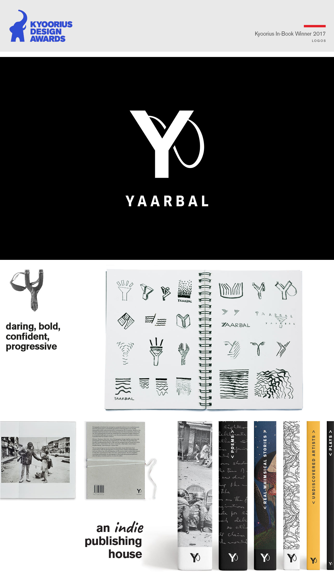
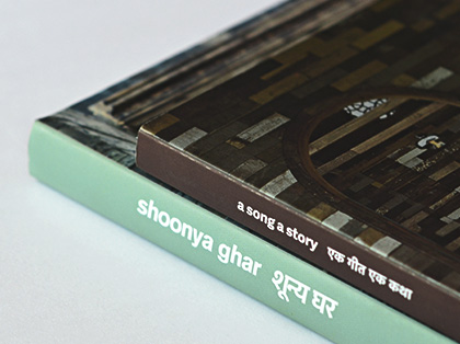
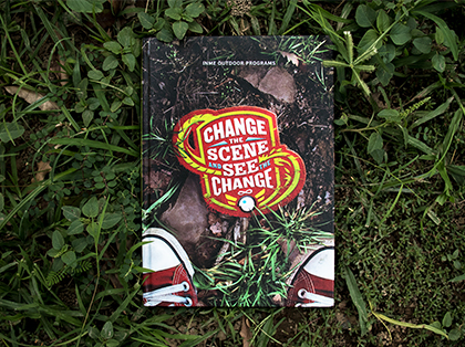
Background Yaarbal is an independent publishing house, promoting subjects that the mainstream publishers would not. In Kashmiri, a yaarbal is a river bank where men and women meet to talk; a space of conviviality and exchange; in Hindi, it can be read as ‘strength from friends’. It functions on a keep afloat basis, without permanent expenses. Our task was to design a versatile mark, to serve as an imprint for books and events.
Approach Readers seek experiences that free them from the safe, sanitised, mainstream: kinds of art or politics, that society marginalises. Yet these readers often also subscribe to society’s power structures. Yaarbal can resolve this contradiction by being a responsible yet unafraid guide to these spaces.
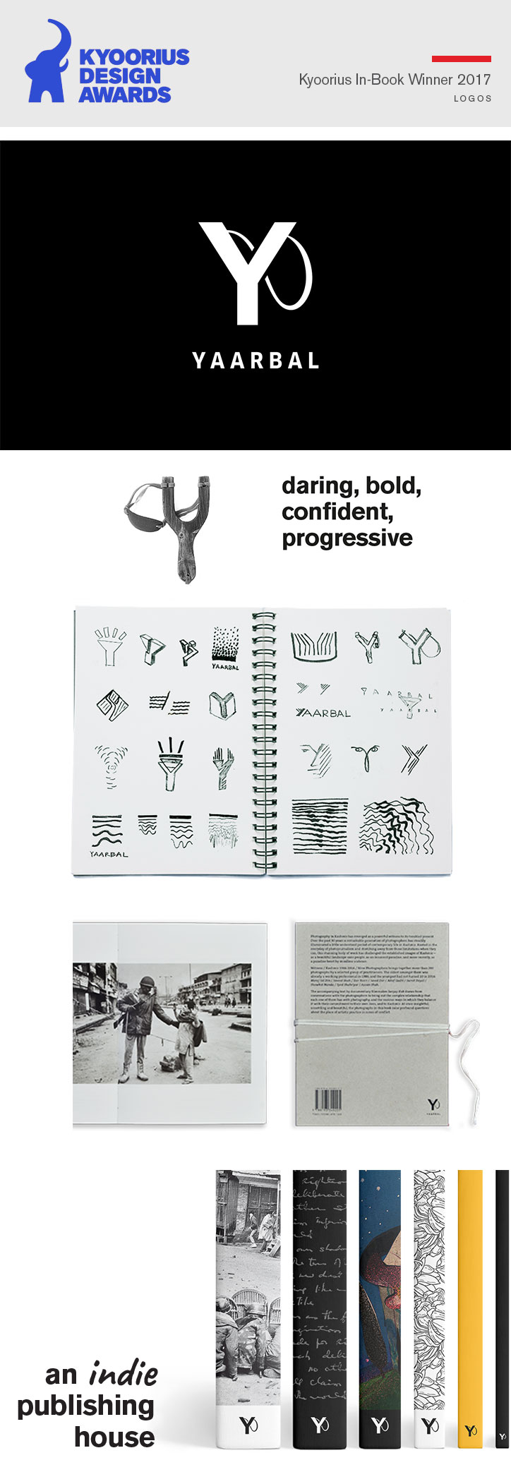
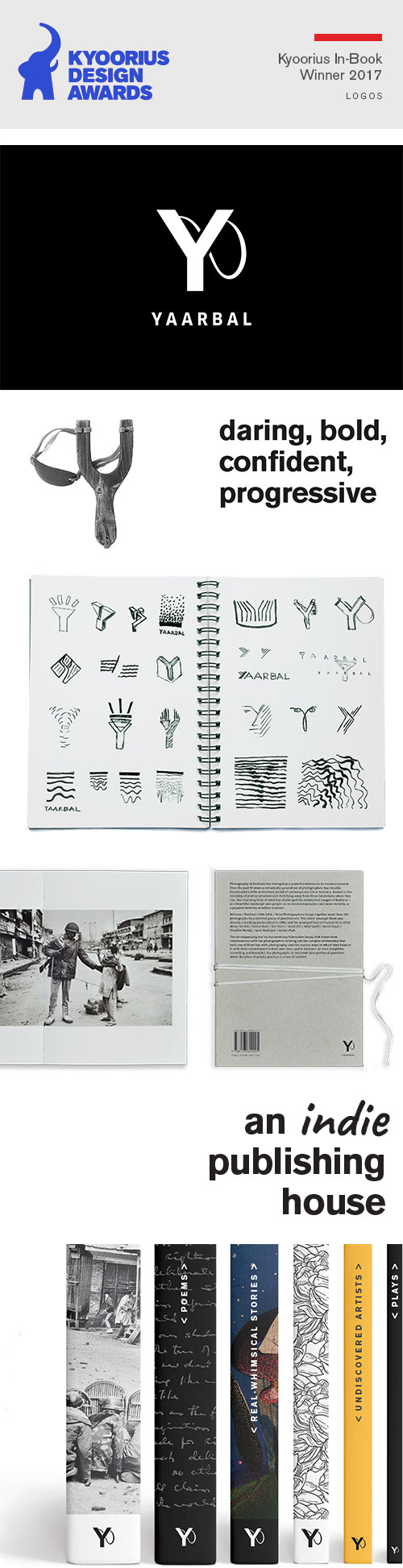
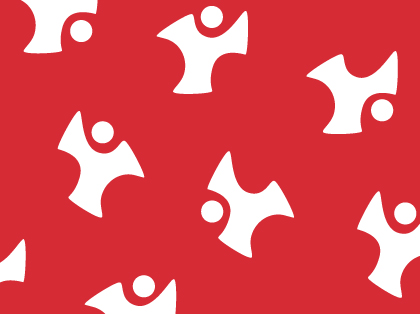
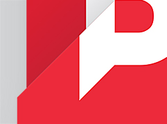
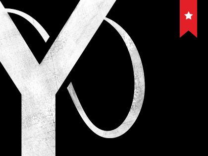
Design A slingshot (or catapult), integrated with a Y. It represents Yaarbal’s mission to swim against the tides of commerce, conformity and power. The slingshot is resourceful and resolute. A toy and a weapon at once, the slingshot has a popular, even cheeky touch, giving Yaarbal the voice of a citizen, speaking for every man. Finally, the bold, solid Y provides the countervailing stability to the project.
Impact Yaarbal identity was an in-book winner at Kyoorius Design Awards 2017 under logo design category.
Credits Creative Direction: Lisa Rath; Team Lead: Richa Bhargava, Designer: Sreeja Chatterjee